Problem
Babylist registries drove purchases from over 700,000 Gift Givers per month. But a daily, recurring survey to Gift Givers consistently tracked that 20% of them had a difficult or very difficult experience.
Here's why: Babylist's core value proposition is a “universal registry” that lets users add “any item from any store” to their registry.
But if a Gift Giver chooses to purchase from any retailer other than the official Babylist Shop, they must:
- 1. click through a redirect modal to leave Babylist
- 2. arrive on the PDP of another retailer and start their checkout flow
- 3. figure out how to get the Registrant's shipping address
- 4. check out on the other website
- 5. return to the Babylist registry to manually record the item as purchased.
Babylist does not know if an item has been purchased from an external retailer unless the user tells us.
Goal
Decrease Gift Giver difficulty from 20% to 10%.
Insight
For Gift Givers that only purchased from the Babylist Shop, the difficulty score was only 5%.
If we could encourage Gift Givers to purchase from Babylist Shop directly, they'd have a much easier time!
(Failed) Solution
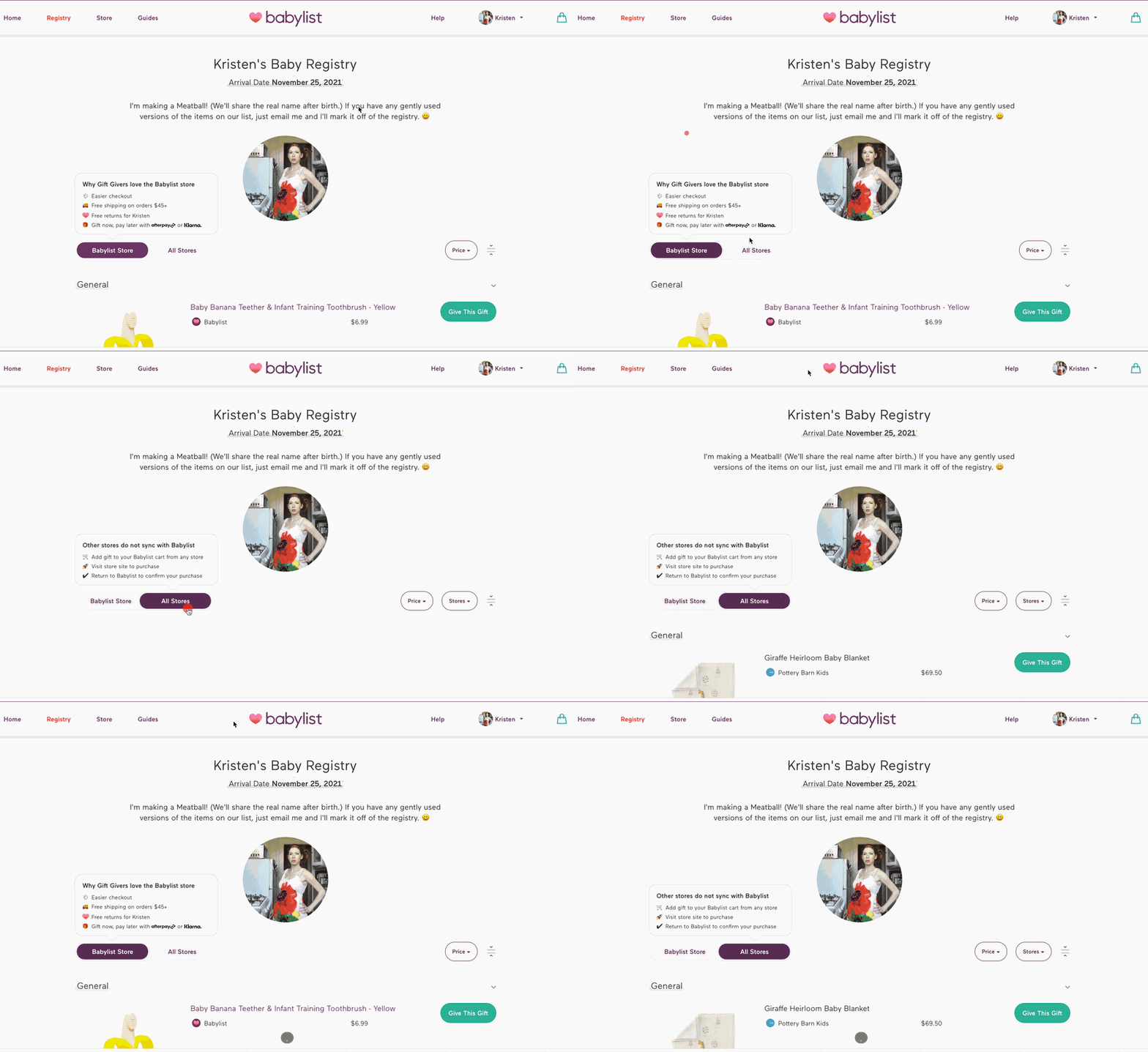
Let users toggle between products sold by the Babylist Shop vs other stores! And default to the Babylist Shop toggle.
We validated the idea with high fidelity Figma prototypes. Gift Givers had a much easier time buying gifts from the registry.
We spent 4 weeks building the experience then released as an A/B test.
Results
A flood of complaints came in from Registrants worried they wouldn't receive most of the items on their registry.
Babylist Shop had a fairly limited catalog at the time, and the vast majority of items had to be purchased from third-party retailers.
When our CS team explained it was an A/B test, users demanded to be removed from the test, threatening to delete their registries and go with Amazon or Target.
Registrants hated this like nothing we'd ever shipped. We rolled back the A/B test within 4 hours.
Learnings
It hit home that these registries are truly personal websites of our users, websites that they invest their own time in and share with their friends and family.
The registries convey who they are and what they value.
What Happened Next
My next swing wasn't to hide away the more difficult third party stores — but for the UX to correctly set expectations with Gift Givers.
That attempt also ultimately failed, but I saw something in that solution that was working.
Product leadership advised I give up on improving the Gift Giver experience. I persuaded the executive team to give me 6 more weeks.
Outcome
My third swing, called “Add or Buy,” succeeded and decreased the Gift Giver difficulty rate from 20% to 12%.